Shutterfly vs Snapfish, Take II
The first print comparison between Shutterfly and Snapfish resulted in a nod to Shutterfly. In the comparison color photo, the Shutterfly colors were vibrant and rich. Skin tones were more realistic. Details were clearer. Pop over and see the comparison, here.
Over the holidays I took a family photo that begged to be printed in Black & White. And since it was a photo to be used as a holiday card, professional printing wasn’t necessary. “So”, I thought to myself, we need to do another Snapfish vs Shutterfly print comparison – this time for B&W.
I see a lot of photos termed B&W that are really a presentation of a rainbow of grays. A perfectly printed and eye appealing B&W photo contains some pure black and pure white and everything in-between. I often have more trouble getting the pure whites than the pure blacks – seems even more difficult with digital – so easy to blow out the highlights. The Zone System, formulated and employed most famously by Ansel Adams, is an 11 zone system categorizing light. The system breaks down the continuous tonal gradation from the purest black to purest white into 11 equal sections. Each section differs from the one next to it by one full stop. It’s too much for this post, but it’s an almost flawless method for printing B&Ws. And if you’re serious about B&Ws, I recommend you learn the technique.
Machine printed B&W prints however are not intended to be a professional end product. It’s possible though to get a nice result, even something frame worthy.
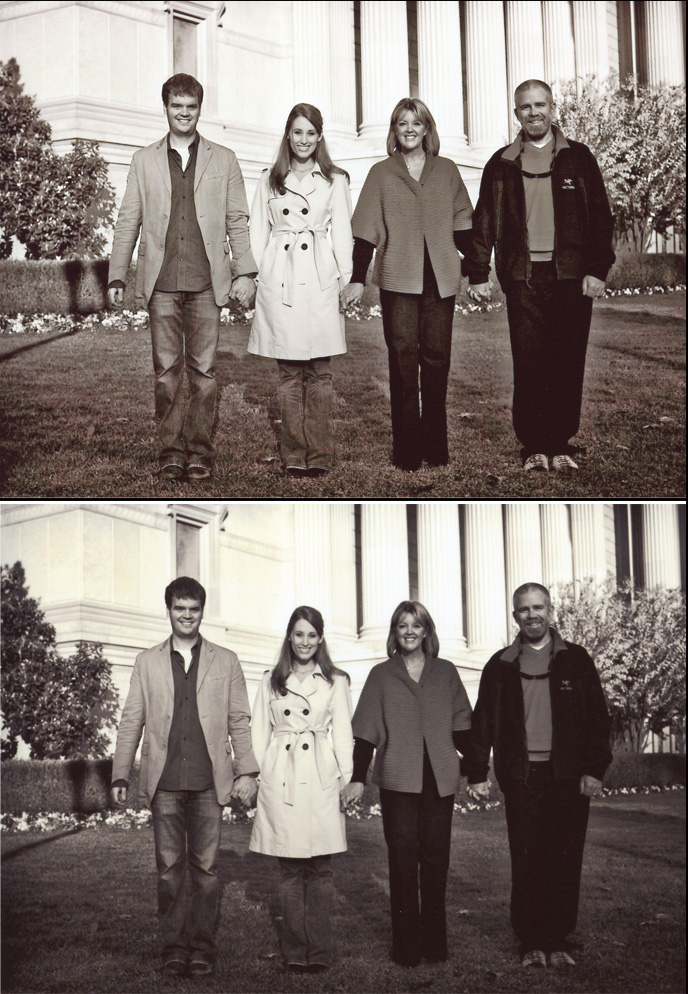
Snapfish top photo. Shutterfly, bottom.
An inspection of the prints reveals:
1) In the Snapfish photo, the shadow thrown by the street lamp on the left of the photo a bit over halfway down, with the main part falling on the hedge, is more defined than in the Shutterfly print with much crisper edges.
2) In the Snapfish photo, the columns of the building in the background are more white, likely falling within a Zone 8-9 category at their lightest.
3) The grass has texture as opposed to the Shutterfly photo where the grass appears a flat, mid-gray blanket.
4) The Crepe Myrtle bush on the right side of the Snapfish photo has more definition compared to Shutterfly’s. You can make out the trunks and the form, shape, and texture of the plant’s top is discernible against the columns. The same goes for the tree on the left.
5) The pansy flowers along the base of the hedge have definition in the Snapfish photo. See flowers on left side of the photo.
6) Now to the people. Take a look at the pale coat. There is no yellow cast in the Snapfish photo. The buttons pop. Her belt has edges; you can make out the knot. The insignia on the guy’s jacket on the right? You can see it in the Snapfish photo. The faces are bright, well defined. Teeth are white. Hands are noticeable. They’re all wearing jeans. In the Snapfish photo you get the the characteristic lightening at the knees, the whiskers, and hem lines of the couple on the left. The couple on the right were wearing black jeans. But even black jeans, unless they’re being worn for the first time, have discernible weave and wear marks. You can see these in the Snapfish photo. In the Shutterfly photo, their pants are almost pure black and without definition.
7) Taking a look overall at the individuals’ expressions, in the Snapfish photo you can see what it is they’re squinting a bit at – the sun. In the Shutterfly photo you wonder.
The Snapfish photo is the superior Black & White image in this case.
My experience has been that Snapfish prints light. But in this comparison, the photo has the proper contrast and exposure. This simple “they got it right” translates to a photo absent the flat, mostly gray/green blah of the Shutterfly print. The Snapfish photo is sharper in detail, crisper in contrast. It has definition and depth that result from the right balance between the lights and darks within the scene. The photo has life because you can see details of clothing, faces, texture of the grass, and trees – a recognition of substance. I asked Shutterfly to print a B&W photo and instead I got a flat, uninteresting photo with a yellow/green tint (can’t even call it Sepia). It suffers from both underexposure and too-low contrast.
One other notable difference? Shutterfly prints on Fuji paper. Snapfish on Kodak. Is there an inherent difference due to the paper? I don’t know, but tune in to find out!
Links:
SRTs perspective on photography


 About SRT... I’m a traveler, writer and photographer for whom the open road frequently summons. Adventurous solo road trips are a staple for me, and a curiosity. So I created this website to share them and inspire you to step out and give them a try. Welcome!
