SRT RSS Feed

Shutterfly: VividPics Technology

Unless I capture an alien and ask Shutterfly to print the photograph, I want no part of green in my black and white prints. Recently this is what Shutterfly gave me in a 4×6:

Shutterfly printing green

Wedding Photo in Green (by Shutterfly)

Oddly, the 5×7 was about as perfect a B&W print as I could ask for (short of printing them myself). Nice blacks. The groom’s shirt is white; the wedding dress was a champagne color, so those are about right too.

0496a

Upon contacting them to request a reprint of the photos, I learned something new about Shutterfly when they sent this reply:

 ” I am sorry to hear that your order did not arrive as you hoped. Shutterfly analyzes your photos and automatically applies enhancements to the photos to improve the exposure and colors in the photos in order to give you the finest quality prints. This feature, which we call our VividPics technology, is applied by default to all Shutterfly prints.”

They went on to say the VividPics technology/process was what was causing the green cast and then gave me a link with instructions on how to disable it.  They did NOT discuss why within the same order, the 4x6s were in green and the 5x7s weren’t…  What they didn’t want to tell me was they’d hired a little green alien in their 4×6 printing line.


So I went to the link, disabled VividPics and received another order of, yup, green 4x6s. Three’s a charm they say and they got it right in the 3rd reprint. It obviously was not the VividPic process, but I learned something in the exercise.  And to their credit they re-printed every time at their expense with no hassle.

If you do a bit more research, there’s a section about ICC Color Profiles: “If you turn off VividPics, all our printers will produce sRGB colors accurately.”  What you have to understand is that to get the photo on your screen at home to look very similar in a printed copy, you’ve got to save your images as sRGB AND calibrate your monitor properly for sRGB output.  Shutterfly mentions a spectrophotometer but only in a sentence that also includes the word “inspired.”

Screen shot of Shutterfly's Help section on color profiles

Bottom line, I learned something. And discovered the “Help” section of the site is quite extensive. Good information.

I’m working on a post comparing a Shutterfly photo book to a Blurb photo book. Good stuff.

Here are other Shutterfly posts on this site:

Shutterfly vs Snapfish, Take II

Shutterfly vs Snapfish


Join the Road Trip Revolution at the Solo Road Trip Facebook Fan Page, here.

John Batdorff. Book Review, “Black and White: From Snapshots to Great Shots”

There have been a few perks to writing this blog. Many connections have been made with individuals that are interesting, talented, and sometimes inspirational.  The people perks are the best but there have been a few damned fine freebies in the way of software (Lightroom for instance) and books. Some of the people connections have been with authors who realized I could write a halfway decent review for them if they comped me an autographed copy.  A few were right in that presumption, but mostly the books never escaped the box before getting the boot to Goodwill (of which I’m a huge fan).

 John Batdorff's Black and White: From Snapshots to Great Shots

Self-help books have a difficult time clamoring into my reading stack. It’s not that I don’t want to improve. I do. But it’s hard to execute from a recliner. Or with my ass bolted to a truck on some American backroad. 

A friend astutely summed it up, “improvement takes a lot of energy.” No shit. It’s one of those ply you in the face truths whose full impact is only grasped when enough birthdays have passed.

The friend, a baker, had worked herself into the landing gears up position for a rant. “It’s simply a truth like fruit isn’t a real dessert. Or church is not church unless someone thrusts a stick of gum at you.” 

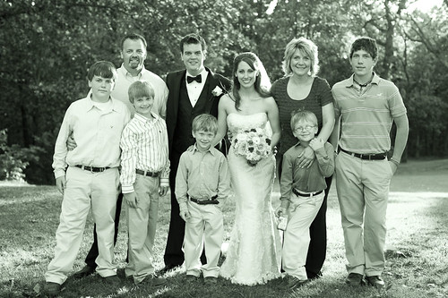
My last conversation with John Batdorff, one of the interesting, talented, AND inspirational connections I’ve made, went like this: “I’ve got to photograph the wedding of a nephew as a favor and there’s no natural light. I don’t even own a flash. Any tips?”  John replied “rent the flash, speak to the Pastor about positioning during the ceremony, and remember to turn the flash back on after you’ve turned it off.”  He’s a lot like my baker friend – they speak in truths that slash right to the good stuff. 


When I opened John’s autographed book “Black and White: From Snapshots to Great Shots”, it was three months before I worked up the energy to flip the pages. But only one evening of page turning and highlighting to complete it.

You shouldn’t bother with this book unless you really do want to expend the energy to improve your black and whites or pry your butt from the recliner over and over. It’s not a read-and-put-away book. It’s one of those rare outputs from a pro photographer that shares not only useful insights and tips but plops you in the action of their workflow – which I’ve struggled with; oh how I’ve struggled. 


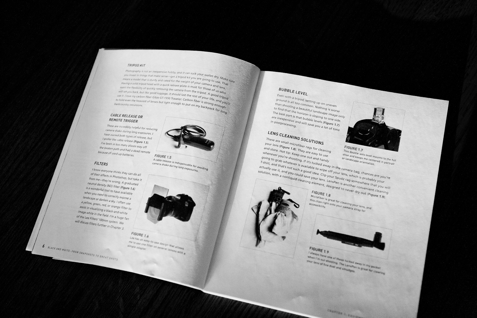
John begins with a peek into his equipment bag. Real pictures of the crap he hauls around. An order with B&H was the first reason I left the recliner. Something must be crooked on me because my horizons are always askew. The bubble level pictured in the book solved my problem. I didn’t know such a thing existed. And The LensPen – you need one of these too. The order halted when I got to the ND filter. Geez I’ve experimented with long exposures with very few satisfactory results. Okay none. Now I know why. The neutral density filter is another must have. But not cheap. It’ll have to wait.

Back in the recliner I get to the part about post-processing software – namely Lightroom.  I’ve got Lightroom! Still in the freebie box however because I just can’t make myself learn yet another software program (or social networking site), I get out of the recliner again to open the damned box. John raves about the program, convincing me finally that it’ll be the last major workflow change I make. Even before I load the software I know he’s right. I’ve fought against moving away from Camera Raw/Bridge. It was a gallant fight but if I want my photography to reach the next rung, Lightroom must be conquered.

Histograms?!  Shit. Another rocking back and forth to extract myself from the recliner to fetch of all things, my camera. I could feel the strain in my thighs that time.

Histograms smack of bell curves, financial analysis – things I know something about. Yuck. So I’ve steered clear of them almost as vehemently as Lightroom. He takes you step by step through a histogram. It’s a rather useful thing.  Looking for a U-curve is something I’ll be doing from now on. It’s the opposite of a bell curve. Which makes me a fan.

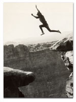
And shooting with intent. Well that’s a biggie. You know it is. Although John doesn’t say a pro shoots with intent and an amateur doesn’t, that’s exactly what he means. And even if you have no goal to become a pro in the sense of money exchanged for services, if you’re serious about your photography you’ve got to have enough knowledge about the photographic process to shoot with intent. The only way to shoot with intent is to know what the hell a histogram indicates. Okay and a few other things like exposure, composition, framing, contrast. All of which he covers in a very readable voice. 

John’s a rule breaker, which contributes to my being a fan of his work. He refers to keeping all the rules in your head as “paralysis of analysis”.  I agree. And that paralysis hits me in the “darkroom” as well as on site. I begin viewing a likeable image and mentally start breaking down over what should be lighter, darker, what shadow detail I should worry about, the highlight details that may be blown out, etc. A lot of great shots never get the deserved attention because I’m too overwhelmed with analyzing the image. He takes us by the hand and walks through all of that utilizing Lightroom – all the way through printing and/or sharing the image online.

What about watermarks? I said in the beginning that this is a book for those photographers desirous of taking the craft to the next level.  That means branding our images.

I want to deter theft.  I’m not a pro but nothing makes me angrier than to see one of my images used elsewhere without credit. If I got the image to the point I was willing to share it, that means I put some time into it and thieving assholes should be lashed for lifting it. In order to save myself from a stroke at the next infraction, I read the part in the book about watermarks, lifted my trembling thighs once again from the recliner, became a Digimarc customer, and followed John’s directions for use. 

There are assignments at the end of every chapter. But geez that would have meant a full work-out.

Fun things in the book I didn’t know but should have: 1) photographing the sun or other lighting sources with a high f-stop will result in a starburst effect and 2) since I shoot in RAW, I can have my camera display in monochrome and still capture all the color information too.  Very cool.

You’re ready for the truth and someone worthy of delivering it in a way that makes you want to pry from the recliner? Then get John Batdorff’s book: Black and White: From Snapshots to Great Shots (click here for link to Amazon page). 

Can you say Virtual Copies??

 ******************************************

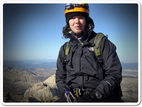
John Batdorff is an award-winning landscape and travel photographer who splits his time between Chicago and Montana. His black and white images have been featured in the National Museum of Wildlife Art in Jackson Hole, Wyoming.  See his work and read his popular photography blog at: John Batdorff Photography Blog

John, thank you for the wedding photography advise. I followed it. And I’ll never photograph another wedding. Ever.  — Tammie


Join the Road Trip Revolution at the Solo Road Trip Facebook Fan Page, here.


Once A Year Capture

Maybe it’s the prolonged heat. Or the boredom from nursing a back injury.

A blast of light that turned a fairly dark tan wall into a projection screen caught my eye as I walked by. A wall mounted mirror in the bathroom to the right of this scene was positioned perfectly to reflect the setting sun coming through a window. The mirror fielded the light onto the wall.

This is what the camera captured – straight out of camera. Since my hand/arm with elbow bent holding the camera to the left of the shot is visible, I’m calling it a self portrait.

The Art of Looking

After noting the time of day, the next day I watched for this to happen again. But the sun’s change in angle over just a day’s time meant this was a once a year capture.

Remind’s me of Ruth Bernhard’s doorknob shot. Well, the circumstance, not the photo.

Join the Road Trip Revolution at the Solo Road Trip Facebook Fan Page, here.

Looking Back Photo Contest Winner!

The winner of the side mirror photography contest is Sarah Reagan’s photo, “Texas Road.” Sarah gets to choose between a $100 gift card from either Amazon or B&H Photo.  Congratulations Sarah!

Photo "Texas Road", by Sarah Reagan

Shot with a Kodak Easy Share camera, Sarah’s photo gives credence to the point I’ve made numerous times – it’s not about the camera – great shots can be had from inexpensive cameras. A little reminder of that: Great Photos from Really Cheap Cameras.

There were many captivating entries.

Shots whose background had no similarities with the reflection, like this photo of Monument Valley from Rex Nemo, were particularly interesting.

Rex Nemo. Monument Valley. Shot from the seat of his bike.

Pure beauty shots.

Dominique Levenberg. "Grand Teton" Taken from her Harley.

Rhonda Morris Schley: "A Look Back Down a Snowy Road"

Gretchen Sanders, "Sometimes, the farthest experiences are the closest to home"

Some showed the contrast inherent in many a road trip – that between the modern conveniences we flee and the peace and tranquility for which we press the pedal.

This from Karen Mallette. “During the same trip through the Southwest, we stopped at the McDonald’s in Page, AZ. As we got ready to hit the road again, I noticed the contrast between the “human” of the building, and the “Godness” of the red rock in the rear view mirror.”

Karen Mallette. McDonald's in the background. Arizona's natural beauty in the reflection.

More than once, the words “changed my life” were with the submission.  Music to my ears.

Shelda Mushroom Fountain Carlock's "Bonnaroo '10". "The road trip that changed my life."

The pet shots were fun!

Photo by Traci Quam Vosen

Photo by Sarah Clark. Sunrise at Canyonlands National Park.

Photo by Alison Turner. "Somebody is tired of camping and wants to go home."

And this from the ultimate road tripper of all –  J.R. Templeton, a hitchhiker, and a vanishing breed.

J.R. Templeton's "Leaving Colorado: A Hitchhiker's Perspective"

Shots that remind us of our own “last views”.  This one brought back a few poignant memories for me.

Kimmie Meaney's "Driving Away from the Old Family Home for the Last Time"

And a reminder of why we road trip – FREEDOM!

Alison Turner's "Freedom"

Remember, these photos are the property of their creators.  Do not copy or download either the photos or any of the text until you get permission from them. Please ask first.

** Join the Road Trip Revolution at the Solo Road Trip Facebook Fan Page, here. **

Shutterfly vs Snapfish, Take II

The first print comparison between Shutterfly and Snapfish resulted in a nod  to Shutterfly.  In the comparison color photo, the Shutterfly colors were vibrant and rich.  Skin tones were more realistic. Details were clearer.  Pop over and see the comparison, here.

Over the holidays I took a family photo that begged to be printed in Black & White. And since it was a photo to be used as a holiday card, professional printing wasn’t necessary. “So”, I thought to myself, we need to do another Snapfish vs Shutterfly print comparison – this time for B&W.

I see a lot of  photos termed B&W that are really a presentation of a rainbow of grays.  A perfectly printed and eye appealing B&W photo contains some pure black and pure white and everything in-between.  I often have more trouble getting the pure whites than the pure blacks – seems even more difficult with digital – so easy to blow out the highlights.  The Zone System, formulated and employed most famously by Ansel Adams, is an 11 zone system categorizing light. The system breaks down the continuous tonal gradation from the purest black to purest white into 11 equal sections.  Each section differs from the one next to it by one full stop. It’s too much for this post, but it’s an almost flawless method for printing B&Ws.  And if you’re serious about B&Ws, I recommend you learn the technique.

Machine printed B&W prints however are not intended to be a professional end product. It’s possible though to get a nice result, even something frame worthy.

Snapfish top photo. Shutterfly, bottom.

Snapfish on top; Shutterfly, bottom

An inspection of the prints reveals:

1) In the Snapfish photo, the shadow thrown by the street lamp on the left of the photo a bit over halfway down, with the main part falling on the hedge, is more defined than in the Shutterfly print with much crisper edges.

2) In the Snapfish photo, the columns of the building in the background are more white, likely falling within a Zone 8-9 category at their lightest.

3) The grass has texture as opposed to the Shutterfly photo where the grass appears a flat, mid-gray blanket.

4) The Crepe Myrtle bush on the right side of the Snapfish photo has more definition compared to Shutterfly’s. You can make out the trunks and the form, shape, and texture of the plant’s top is discernible against the columns. The same goes for the tree on the left.

5) The pansy flowers along the base of the hedge have definition in the Snapfish photo.  See flowers on left side of the photo.

Snapfish on top. Shutterfly, bottom.

6) Now to the people. Take a look at the pale coat. There is no yellow cast in the Snapfish photo. The buttons pop. Her belt has edges; you can make out the knot.  The insignia on the guy’s jacket on the right?  You can see it in the Snapfish photo. The faces are bright, well defined. Teeth are white. Hands are noticeable. They’re all wearing jeans.  In the Snapfish photo you get the the characteristic lightening at the knees, the whiskers, and hem lines  of the couple on the left. The couple on the right were wearing black jeans.  But even black jeans, unless they’re  being worn for the first time, have discernible weave and wear marks. You can see these in the Snapfish photo. In the Shutterfly photo, their pants are almost pure black and without definition.

7) Taking a look overall at the individuals’ expressions, in the Snapfish photo you can see what it is they’re squinting a bit at – the sun.  In the Shutterfly photo you wonder.

The Snapfish photo is the superior Black & White image in this case.

My experience has been that Snapfish prints light. But in this comparison, the photo has the proper contrast and exposure. This simple “they got it right” translates to a photo absent the flat, mostly gray/green blah of the Shutterfly print. The Snapfish photo is sharper in detail, crisper in contrast. It has definition and depth that result from the right balance between the lights and darks within the scene. The photo has life because you can see details of clothing, faces, texture of the grass, and trees – a recognition of substance. I asked Shutterfly to print a B&W photo and instead I got a flat, uninteresting photo with a yellow/green tint (can’t even call it Sepia). It suffers from both underexposure and too-low contrast.

One other notable difference?  Shutterfly prints on Fuji paper. Snapfish on Kodak.  Is there an inherent difference due to the paper?  I don’t know, but tune in to find out!

Links:

Snapfish

Shutterfly

SRTs perspective on photography

Join the Road Trip Revolution at the Solo Road Trip Facebook Fan Page, here.


The Grand Climb


Tammie DooleyAbout SRT... I’m a traveler, writer and photographer for whom the open road frequently summons. Adventurous solo road trips are a staple for me, and a curiosity. So I created this website to share them and inspire you to step out and give them a try. Welcome!

A soul that sees beauty may sometimes walk alone – Wolfgang Von Goethe

  • Categories


  •  

    Connect with SRT

    RSS Connect on Twitter Subscribe by Email
    Email me
    Become a SRT Facebook Fan
    Follow me on Twitter
    See my photos on Flickr

    I want to hear from you!
    ~ Tammie


    World Reviewer adventure travel blogs